


No products in the cart.
Dashboard Design
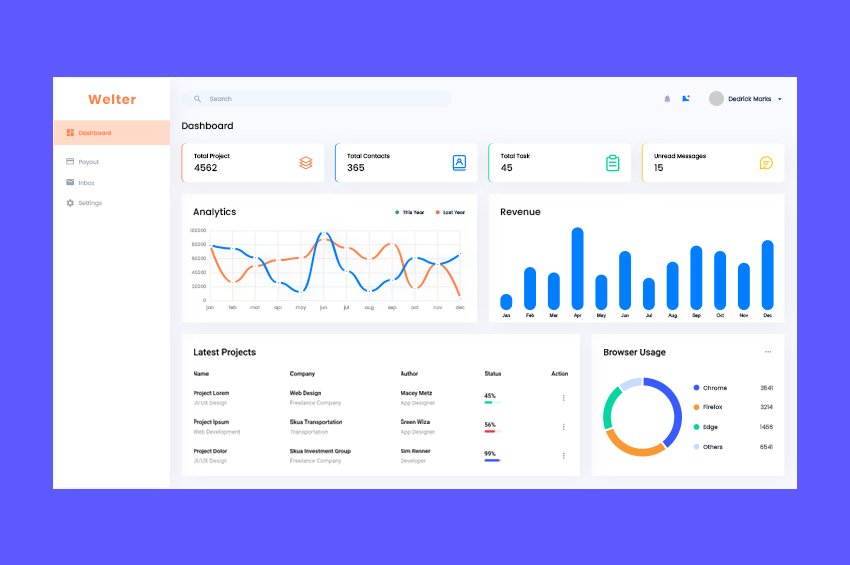
Project Details
Conducting a review of a dashboard design project involves evaluating various aspects such as usability, visual appeal, functionality, and alignment with user needs. Here’s a structured approach for reviewing your dashboard design project:
Dashboard Design Project Review
1. Objective Assessment
- Project Goals: What were the primary objectives of the dashboard? (e.g., data visualization, performance tracking, decision-making support)
- Target Audience: Is the dashboard tailored to the needs and preferences of its intended users (e.g., executives, analysts, operational staff)?
2. Design Quality
- Visual Appeal: Is the design modern and visually appealing? Are colors, fonts, and icons used effectively to enhance understanding?
- Layout: Is the layout intuitive and well-structured? Are key metrics and information prioritized and easily accessible?
- Consistency: Are design elements consistent throughout the dashboard, including color schemes, typography, and iconography?
3. Data Presentation
- Clarity: Are data visualizations (charts, graphs, tables) clear and easy to interpret? Do they accurately represent the underlying data?
- Simplicity: Is complex data presented in a simplified manner? Are unnecessary elements removed to avoid clutter?
- Interactivity: Are there interactive features (e.g., filters, tooltips, drill-downs) that enhance user engagement and exploration of data?
4. Functionality
- Performance: Does the dashboard load quickly and operate smoothly? Are there any performance issues that could hinder user experience?
- Integration: Can the dashboard integrate seamlessly with other tools or data sources? Is it easy to update data in real-time?
- Customization: Are users able to customize their views or settings to suit their preferences?
5. User Experience (UX)
- Navigation: Is the navigation intuitive? Can users easily find the information they need without confusion?
- Onboarding: Is there a clear onboarding process for new users? Are there tutorials or guides available to help users understand the dashboard features?
- Feedback Mechanisms: Are there ways for users to provide feedback or report issues with the dashboard?
6. Accessibility
- Compliance: Does the dashboard comply with accessibility standards (e.g., WCAG)? Are color contrasts sufficient for users with visual impairments?
- Alternative Text: Are visual elements accompanied by alternative text or descriptions where necessary?
7. Market Research and Trends
- Industry Standards: Does the dashboard adhere to current design trends and best practices in data visualization?
- Competitive Analysis: How does the dashboard compare to similar offerings in the market? What differentiates it from competitors?
8. Future Improvements
- Areas for Enhancement: Identify specific areas where improvements could be made (e.g., adding new visualizations, enhancing interactivity).
- Feature Expansion: Are there opportunities to add new features or integrate additional data sources in the future?
Recommendations
- User Testing: Conduct user testing sessions to gather insights on usability and areas for improvement.
- Regular Updates: Plan for regular updates to keep the dashboard current with user needs and data changes.
- Feedback Loop: Establish a feedback mechanism for users to suggest improvements or report issues.
Conclusion
A successful dashboard design should effectively communicate data insights, enhance user experience, and support decision-making. By assessing these components, you can identify strengths and areas for improvement, ensuring the dashboard serves its intended purpose effectively.
If you have specific elements of the project you’d like to discuss further or need assistance with, feel free to ask!


Pre-made Template